Ordinations
Objectives
Introduction
A common method to investigate the relatedness of samples to one another is to calculate ordinations and to visualise this in the form of a principal components analysis (PCA) or non-metric multidimensional scaling (nMDS) plot. In this exercise, we will calculate ordinations based on weighted and unweighted (binary) Bray-Curtis dissimilarity and present these in nMDS plots.
The coverage tables generated in earlier exercises have been copied to 11.data_presentation/coverage/ a for use in these exercises.
In addition to this, a simple mapping file has also been created (11.data_presentation/coverage/mapping_file.txt). This is a tab-delimited file listing each sample ID in the first column, and the sample "Group" in the second column (Group_A, Group_B, and Group_C). This grouping might represent, for example, three different sampling sites that we want to compare between. If you had other data (such as environmental measures, community diversity measures, etc.) that you wish to incorporate in other downstream analyses (such an fitting environmental variables to an ordination) you could also add new columns to this file and load them at the same time.
Note
As discussed in the coverage exercises, it is usually necessary to normalise coverage values across samples based on equal sequencing depth. This isn't necessary with the mock metagenome data we're working with, but if you include this step in your own work you would read the normalised coverage tables into the steps outlined below.*
1. Import and wrangle data in R
To get started, open RStudio and start a new document.
Note
You will recognise that the first few steps will follow the same process as the previous exercise on generating coverage heatmaps. In practice, these two workflows can be combined to reduce the repetitive aspects.
1.1 Prepare environment
First, set the working directory and load the required libraries.
code
Import coverage tables and mapping file.
code
1.2 Wrangle data
As before in coverage exercise, we need to obtain per MAG and sample average coverage values. We begin by selecting relevant columns and renaming them.
code
2. Calculate weighted and unweighted dissimilarities
It is often useful to examine ordinations based on both weighted and unweighted (binary) dissimilarity (or distance) metrics. Weighted metrics take into account the proportions or abundances of each variable (in our case, the coverage value of each bin or viral contig). This can be particularly useful for visualising broad shifts in overall community structure (while the membership of the community may remain relatively unchanged). Unweighted metrics are based on presence/absence alone, and can be useful for highlighting cases where the actual membership of communities differs (ignoring their relative proportions within the communities).
Here we will use the functions vegdist() and metaMDS() from the R package vegan to generate weighted and unweighted Bray-Curtis dissimilarity matrices and nMDS solutions for the microbial bin data and viral contigs data.
Setting seed
You may also wish to make use of the set.seed() function before each calculation to ensure that you obtain consistent results if the same commands are re-run at a later date.
code
From here on out, we will process the data using the same functions/commands. We can make our code less redundant by compiling all necessary inputs as a list, then processing them together. This is achieved by using the map(...) family of functions from the purrr package.
code
3. Generate ordination
We now generate and visualise all ordinations in 4 panels them using native plotting methods.
code
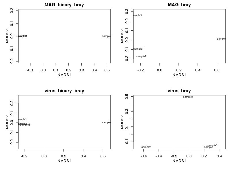
Plotting via this method is a quick and easy way to look at what your ordination looks like. However, this method is often tedious to modify to achieve publication quality figures. In the following section, we will use ggplot2 to generate a polished and panelled figure.
The map(...) function iterates through a list and applies the same set of commands/functions to each of them. For map2(...), two lists are iterated concurrently and one output is generated based on inputs from both lists. The base R equivalent is the apply(...) family of functions. Here, we need to perform the same analyses on similar data types (dissimilarities of different kinds and organisms). These are powerful functions that can make your workflow more efficient, less repetitive, and more readable. However, this is not a panacea and there will be times where for loops or brute coding is necessary.
4. Extract data from ordination
Before proceeding to plotting using ggplot2. We need to extract the X and Y coordinates from the ordination result using scores(). We then also need to "flatten" the list to a single data frame as well as extract other relevant statistics (e.g. stress values).
code
If you click on scrs_all in the 'Environment' pane (top right), you will see that it is a data frame with the columns:
data_type: Label for data output (weighted MAG coverage; unweighted MAG coverage, ...)sample: Sample namesNMDS1andNMDS2: X and Y coordinates for each plot
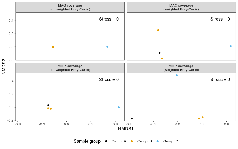
5. Build the ordination plot
After obtaining the coordinates (and associated statistics), we can use it as input to ggplot() (the function is ggplot() from the package called ggplot2). As before, we will set our colour palette first. We will also generate a vector of panel headers.
code
The code above can be summarised to the following:
- Call
ggplot()which initiates an empty plot. It reads in the data framescrs_allas the main source of data and setsNMDS1andNMDS1asxandycoordinates, as well as designates colour based on theGroupcolumn. geom_pointspecifies that we want to plot points (i.e. a scatterplot), and we also set a size for all points.scale_colour_manualspecifies our preferred colour palette and names our colour legend.facet_wrapspecifies that we want to panel our figure based on thedata_typecolumn and that the labels/headers (a.k.a.labellers) should be printed according to thepanel_labelobject.- We also add text annotations using
geom_text, but that it should read data from thestress_valuesdata frame and do not use data arguments (viainherit.aes = F) specified above inggplot(). Text adjustments were made usingsize,vjustandhjust. theme_bwspecifies the application of a general, monochromatic theme.- Elements of the monochromatic theme were modified based on arguments within
theme()
You should try and modify any of the arguments above to see what changes: Change sizes, colours, labels, etc...
ggplot2 implements extremely flexible plotting methods. It uses the concept of layers where each line after + adds another layer that modifies the plot. Each geometric layer (the actual plotted data) can also read different inputs. Nearly all aspects of a figure can be modified provided one knows which layer to modify. To start out, it is recommended that you take a glance at the cheat sheet.
Note
How informative these types of analyses are depends in part on the number of samples you actually have and the degree of variation between the samples. As you can see in the nMDS plots based on unweighted (binary) Bray-Curtis dissimilarities (especially for the MAGs data) there are not enough differences between any of the samples (in this case, in terms of community membership, rather than relative abundances) for this to result in a particularly meaningful or useful plot in these cases.
Follow-up analyses
It is often valuable to follow these visualisations up with tests for \(\beta\)-dispersion (whether or not sample groups have a comparable spread to one another, i.e. is one group of communities more heterogeneous than another?) and, provided that beta-dispersion is not significantly different between groups, PERMANOVA tests (the extent to which the variation in the data can be explained by a given variable (such as sample groups or other environmental factors, based on differences between the centroids of each group).
Beta-dispersion can be calculated using the betadisper() function from the vegan package (passing the bray.dist data and the map$Group variable to group by), followed by anova(), permutest(), or TukeyHSD() tests of differences between the groups (by inputting the generated betadisper output). PERMANOVA tests can be conducted via the adonis() function from the vegan package. For example: