Coverage heatmaps
Objectives
Build a heatmap of average coverage per sample using R
One of the first questions we often ask when studying the ecology of a system is: What are the pattens of abundance and distribution of taxa across the different samples? In the previous coverage calculation exercises we generated per-sample coverage tables by mapping the quality-filtered unassembled reads back to the refined bins and the viral contigs to then generate coverage profiles for each.
As a reminder:
Genomes in higher abundance in a sample will contribute more genomic sequence to the metagenome, and so the average depth of sequencing coverage for each of the different genomes provides a proxy for abundance in each sample.
A simple way to present this information is via a heatmap. In this exercise we will build a clustered heatmap of these coverage profiles in R. Since we also have tables of taxonomy assignments (via gtdb-tk for MAGs) and/or predictions (via vContact2 for viral contigs), we will also use these to add taxonomy information to the plot.
The coverage and taxonomy tables generated in earlier exercises have been copied to 11.data_presentation/coverage/ for use in these exercises.
In addition to this, a simple mapping file has also been created (11.data_presentation/coverage/mapping_file.txt). This is a tab-delimited file listing each sample ID in the first column, and the sample "Group" in the second column (Group_A, Group_B, and Group_C). This grouping might represent, for example, three different sampling sites that we want to compare between. If you had other data (such as environmental measures, community diversity measures, etc.) that you wish to incorporate in other downstream analyses (such an fitting environmental variables to an ordination, or correlation analyses) you could also add new columns to this file and load them at the same time.
Note
As discussed in the coverage and taxonomy exercises, it is usually necessary to normalise coverage values across samples based on equal sequencing depth. This isn't necessary with the mock metagenome data we're working with, but if you include this step in your own work you would read the normalised coverage tables into the steps outlined below.*
Part 1 - Building a heatmap of MAG coverage per sample
To get started, if you're not already, log back in to NeSI's Jupyter hub and make sure you are working within RStudio with the required packages installed (see the data presentation intro for more information).
1.1 Prepare environment
First, set the working directory and load the required libraries.
code
NOTE: after copying this code into the empty script file in Rstudio, remember that, to run the code, press <shift> + <enter> with the code block selected.
Import all relevant data as follows:
code
1.2 Wrangle data
After importing the data tables, we need to subset the tables to only relevant columns. As noted during the coverage exercises, it is important to remember that we currently have a table of coverage values for all contigs contained within each MAG. Since we're aiming to present coverage for each MAG, we need to reduce these contig coverages into a single mean coverage value per MAG per sample.
In the following code, we first select() columns of interest (i.e. the contig ID and sample coverages). We then remove the .bam suffix using the rename_with() function. Given that we require mean coverages per MAG, we create a column of MAG/bin IDs (via mutate) by extracting the relevant text from the contig ID using str_replace(). Finally, we group the data by the bin ID (via group_by()) then use a combination of summarise() and across() to obtain a mean of coverage values per bin per sample. Here, summarise() calculates the mean based on grouping variables set by group_by(), and this is done across() columns that have the column header/name which contains("sample").
code
Next, we would also like to append the lowest identified taxonomy to each MAG. But before that, we will need to tidy up the taxonomy table to make it more readable.
In the following code, we first select() the user_genome (which is equivalent to binID above) and the relevant taxonomic classification columns. We then separate() the taxonomic classification column from a long semicolon-separated (;) string to 7 columns describing the MAG's domain, phylum, class, order, family, genus, and species. Finally, we polish the taxonomy annotations. We remove the hierarchical prefixes by retaining everything after the double underscores (__) via str_replace across all columns except user_genome (via inverse selection).
code
After obtaining a tidy taxonomy table, we append the species annotations to the bin IDs as follows:
left_join()a subset of the columns (user_genome,species) frombin_taxonomygenerated above based on bin IDs. Bin IDs isbinIDinMAG_covand inuser_genomeinbin_taxonomy, so we must specifically tellleft_join()which columns to joinby.- We
unite()the columnsbinIDandspeciesas 1 column and place an underscore_betwee the strings. - We then convert the
binIDcolumn intorownamesfor thedata.framein preparation for the other steps.
code
Too much data?
In your own work, if you have too many MAGs, it can be difficult to present them concisely in a heatmap. Thus, you may want to only retain MAGs that fulfill some criteria.
For example, you may only be interested in the top 10 MAGs based on coverage:
code
Perhaps you want to filter MAGs based on their prevalence across your sampling regime? Assuming you would like to retain MAGs that are present in at least 50% of your samples:
code
Very often, coverage data generated using metagenomic methods can be sparse and/or have values that differ by large orders of magnitude. This can hamper effective visualisation of the data. To remedy this, we can perform numeric transformations that can enhance visualisation of relative differences between values. Here, we will use a logarithm (base 2) transform with 1 added as a pseudo-count (because \(\log 0\) is undefined).
On data transformation
Transformations applied to enhance data visualisation are not necessarily suitable for downstream statistical analyses. Depending on the attributes of your data (shape, sparsity, potential biases, etc.) and choice of analyses, it is recommended that you become familiar with field and tool-specific assumptions, norms and requirements for data transformation.
1.3 Order the heatmap
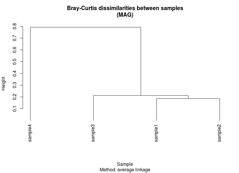
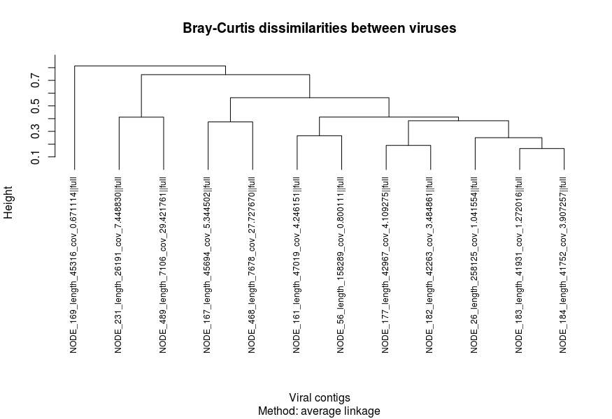
We then need to prepare some form of ordering for our heatmap. This is usually presented in the form of a dendrogram based on results from hierarchical clustering. To do this, we first need to generate two dissimilarity/distance matrices based on transformed coverage values:
- Sample-wise dissimilarities
- MAG-wise dissimilarities
Here, we calculate Bray-Curtis dissimilarity using vegdist() to generate dissimilarities between samples and MAGs. Then, the matrices are used as input to perform hierarchical clustering and plotted.
code

Exporting figures
To export figures you have made, navigate your mouse pointer to the bottom right pane, then click on 'Export' on the second toolbar of the pane. You can export your figure as an image (e.g. TIFF, JPEG, PNG, BMP), a vector image (i.e. PDF, SVG) or PostScript (EPS).
If you would like to do this via code, you can wrap the plot code in between functions for graphic devices (i.e. png(), jpeg(), tiff(), bmp(), pdf(), and postscript()) and dev.off(). The following is an example:
1.4 Set colour palettes
The penultimate step before building our heatmap is to set the colours that will be used to represent annotations and the cell/tile values. In this case, annotations are sample groups as designated in the metadata (a.k.a. mapping) file and MAG taxonomy. In the code below, we will set 3 palettes:
- Sample groups
- MAG phylum
- Cell/tile values
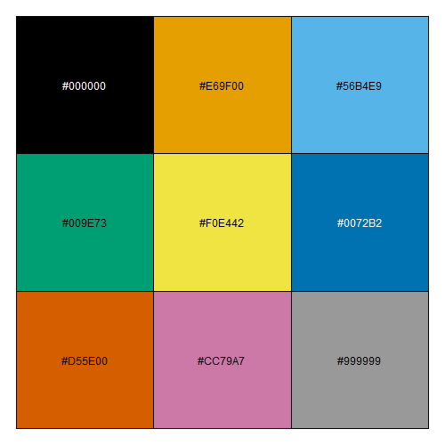
Pre-installed colour palettes
Base R has many colour palettes that come pre-installed. Older versions of R had colour palettes (also known as palette R3) that were not ideal for people with colour vision deficiencies. However, newer versions (4.0+) now carry better palettes that are more colour-blind friendly (see here).
You can also quickly check what these colour palettes are:
code
code
1.5 Build heatmap
code
Results at a glance
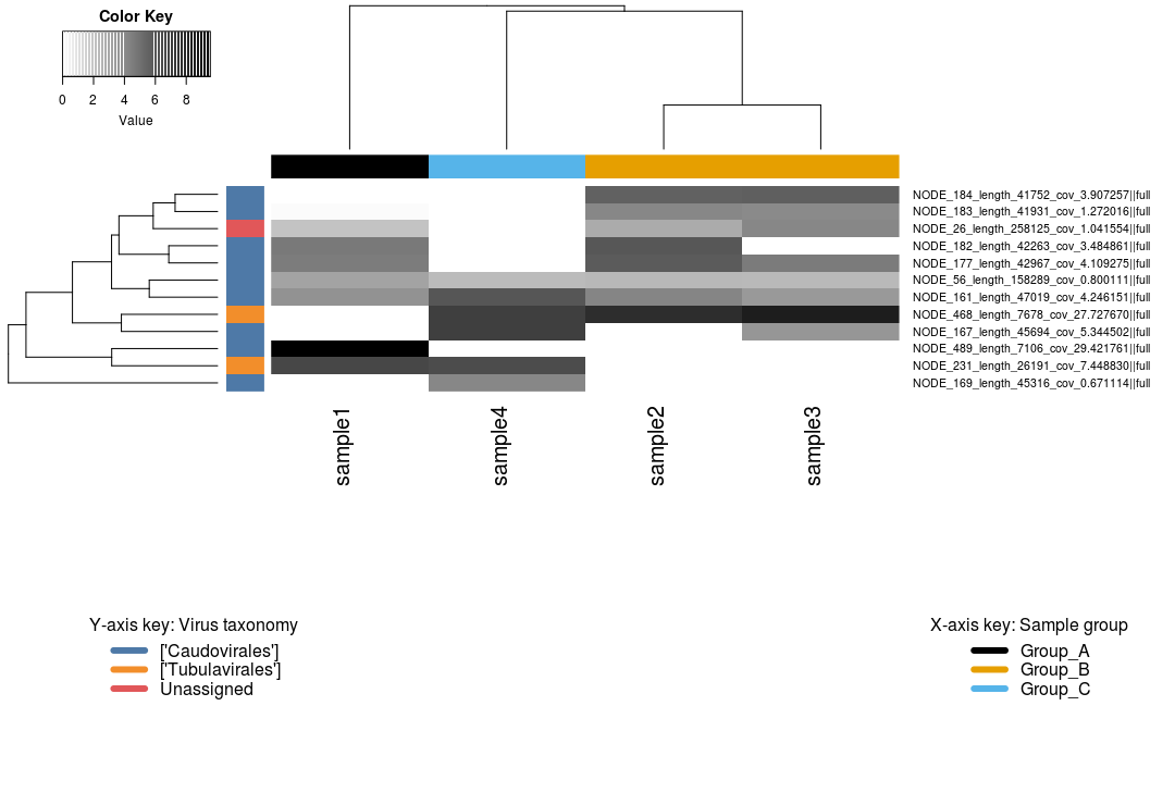
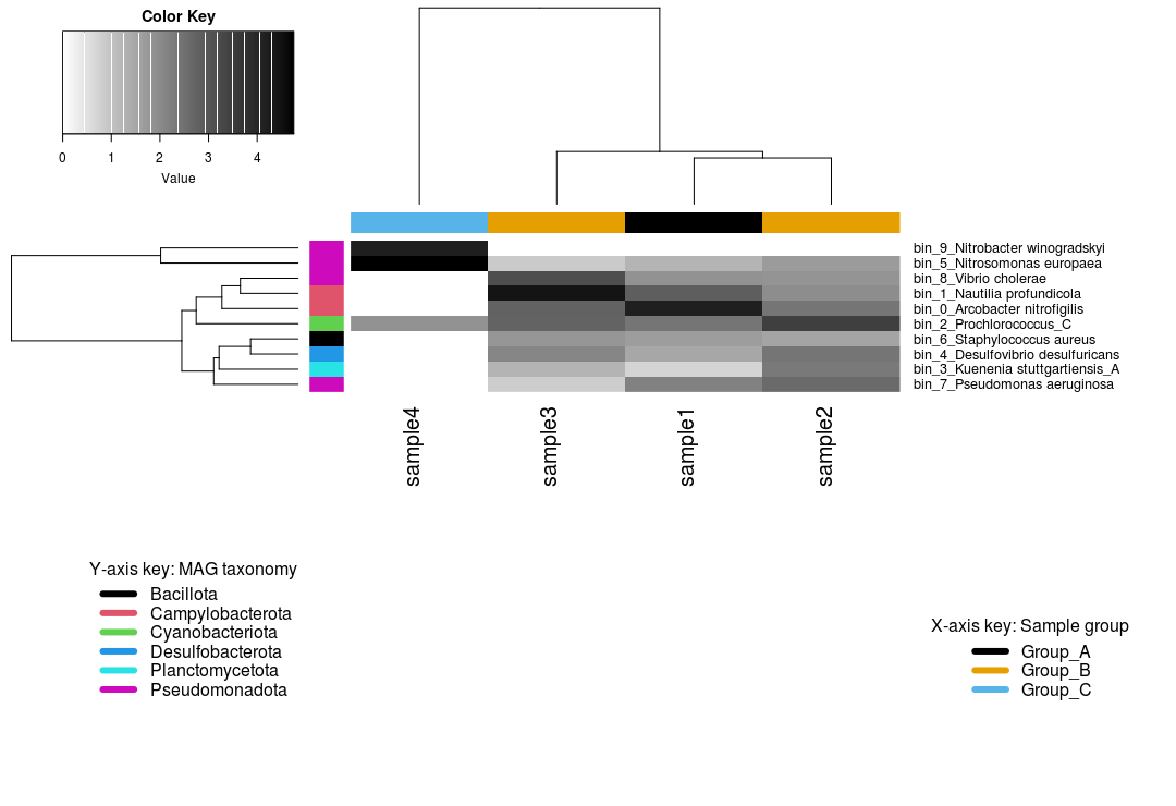
The heatmap shows us that:
- 4 MAGs belong to the phylum Pseudomonadota
- Sample 4 belonging to Group C is somewhat of an outlier, with only 3 MAGs recovered from this sample
bin_9, a Nitrobacter, is only found in sample 4- Presumably, sample 4 has a high abundance of nitrogen cycling MAGs
- Samples from Groups A and B recovered the same bins
You can and should experiment with different paramters and arguments within the heatmap.2 function. A good starting point is cex = ... which controls "character expansion" (i.e. text size). Here, we use the ...SideColors argument to annotate MAG phylum and sample grouping. We also use legend to provide additional information on what those colours represent. Read the help page for heatmap.2() by typing ?heatmap.2 into the console. The help manual will appear on the bottom right pane.
Here, we arrange our columns based Bray-Curtis dissimilarities between samples. However, you may want to enforce or preserve some form of sample order (samples from the same transect, chronological/topological order, etc.). You can do this by setting Colv = FALSE.
Arranging figure elements
As observed in the above plot, the positioning and arrangement of the colour key and legends relative to the main heatmap may not be ideal. Often times, it is desirable to manually arrange or resize elements of a figure (legends, keys, text). This is usually done by exporting the figure in a format capable of preseving vectors (e.g. SVG or PDF) and then post-processing them in vector graphics software such as Adobe Illustrator or Inkscape.
Part 2 - Building a heatmap of viral contigs per sample
We can run through the same process for the viral contigs. Many of the steps are as outlined above, so we will work through these a bit quicker and with less commentary along the way. However, we will highlight a handful of differences compared to the commands for the MAGs above, for example: steps for selecting and/or formatting the taxonomy; importing the quality output from CheckV; and the (optional) addition of filtering out low quality contigs.
2.1 Prepare environment
This has already been done above. We will immediately begin wrangling the data.
2.2 Wrangle data
To start, we need to identify viral contigs of at least medium quality. THis will be used as a filtering vector.
code
We then obtain the coverage matrix and transform the values to enhance visualisation.
code
2.3 Order the heatmap
code

2.4 Set colour palettes
For colours based on sample group, we will retain the colours set as above. Here, we will only set a new palette (Tableau 10) for viruses based on the predicted taxonomy.
code
code
2.5 Build heatmap
code