# install.packages("palmerpenguins")
# install.packages("tidyverse") # tidyverse contains ggplot2
library(palmerpenguins)
library(ggplot2)Visualisation with ggplot2
In this section we will cover the basic format of ggplot functions. We will note the format and key arguments. This code will be repeated throughout the workshop, and provided frequently as a template: therefore, the goal is not to memorise, but to be able to recognise and interpret while we build in complexity throughout the day.
Load packages and prep data
Load the palmerpenguins package for an example dataset and ggplot2 for the plotting functions.
The palmerpenguins package has loaded a hidden object into your R environment, called penguins, which has data we will use for plotting.
head(penguins)# A tibble: 6 × 8
species island bill_length_mm bill_depth_mm flipper_length_mm body_mass_g
<fct> <fct> <dbl> <dbl> <int> <int>
1 Adelie Torgersen 39.1 18.7 181 3750
2 Adelie Torgersen 39.5 17.4 186 3800
3 Adelie Torgersen 40.3 18 195 3250
4 Adelie Torgersen NA NA NA NA
5 Adelie Torgersen 36.7 19.3 193 3450
6 Adelie Torgersen 39.3 20.6 190 3650
# ℹ 2 more variables: sex <fct>, year <int>The penguins object from the palmerpenguins dataset includes NAs. For simplicity we will remove these NAs, and call our new object penData.
penData <- na.omit(penguins)

head(penData)
# A tibble: 6 × 8
species island bill_length_mm bill_depth_mm flipper_length_mm body_mass_g
<fct> <fct> <dbl> <dbl> <int> <int>
1 Adelie Torgersen 39.1 18.7 181 3750
2 Adelie Torgersen 39.5 17.4 186 3800
3 Adelie Torgersen 40.3 18 195 3250
4 Adelie Torgersen 36.7 19.3 193 3450
5 Adelie Torgersen 39.3 20.6 190 3650
6 Adelie Torgersen 38.9 17.8 181 3625
# ℹ 2 more variables: sex <fct>, year <int>na.omit()
The na.omit() function will remove all rows for which an NA exists anywhere in the row. This gives us a nice clean dataset for today, but you may want to use it cautiously on your own data. For example, in our penguins dataset there could be perfectly usable data about an individual’s bill and flipper lengths, but if the sex was not recorded and is therefore an NA, the entire row (i.e., all the data for one individual) would be omitted using na.omit().
The ggplot format
Many modern R workshops include a section on the Grammer of Graphics, or the ggplot2 function, and there is no shortage of detailed workshops and tutorials available if you want more detailed explanations of the basics.
ggplot2 is a way to create visualisations within the tidyverse. Once you recognise the template it will become quick and easy to create a variety of plots with different data types with minimal extra work.
The format for the ggplot2 template is as follows:
Specify the data as a dataframe in long format
Map variables i.e., map species column to the x axis and the bill length column to the y axis
Chose the geom to create the plot type
ggplot(data = penData, mapping = aes(x = species, y = bill_length_mm)) +
  geom_boxplot()
It is good practise to also use indentations to format our code. This will be necessary as our code gets more and more complicated. Each time you reach a new argument (separated by a comma) hit enter or return, and R will automatically format the code on a new line. Try re-write the code above as below, then run the code to generate the plot.
ggplot(data = penData,
       mapping = aes(x = species,
                     y = bill_length_mm)) +
  geom_boxplot()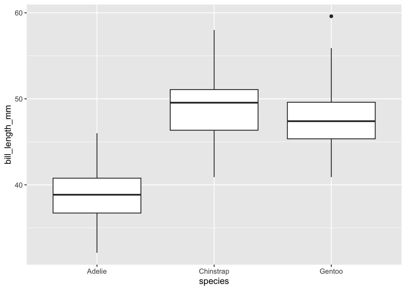
Some things to note about the format:
Indentations are important. We use new lines and tabs to keep the code organised. Generally you’ll want to specify only one thing per line (e.g., data, x axis and y axis get there own lines).
There are actually two separate functions here: the
ggplot()function, which is used to specify the data and map the variables, and thegeom_boxplot()function which is used to create the actual plot. Because we want these two functions to work together, at the very end of theggplot()function, we have added a “+” symbol. RStudio interprets this to mean “The ggplot function has finished, but it must be interpreted in the context of the next function”.geom_boxplot()is the function for making boxplots. To make a bar plot we would usegeom_bar(), to make a scatter plot we usegeom_point()etc.,. Typegeom_in the console and scroll the dropdown menu to see the different geom types - there are plenty!
Extending the ggplot format
We can extend the plot in three easy ways:
Mapping additional data to variables (e.g., species or sex to variables such as colour and shape)
Supplying additional arguments to the geom function (e.g., changing the size, colour or opacity of dots)
Add new functions that control features such as the title or axes labels.
In all cases, these new arguments and functions follow the template as outlined above. We will continue to use indentations and new lines to keep our code organised and tidy.
This example creates a more complex plot, but these new arguments and functions follow the template as outlined above. We continue to use indentations and new lines to keep our code organised and tidy.
Load the viridis library, which supplies a colour scheme that is sensitive to colour-blindness. New arguments map species to the colour variable, so that each point is coloured by species. Sex is mapped to shape. Note that shape can only take discrete variables.
# install.packages("viridis")
library(viridis)


ggplot(data = penData,
       mapping = aes(x = bill_length_mm,
                     y = flipper_length_mm,
                     colour = species,
                     shape = sex)) +
  geom_point() +
  scale_colour_viridis(discrete = TRUE) +
  labs(x = "Bill length (mm)",
       y = "Flipper length (mm)") +
ggtitle("Bill length vs flipper length") 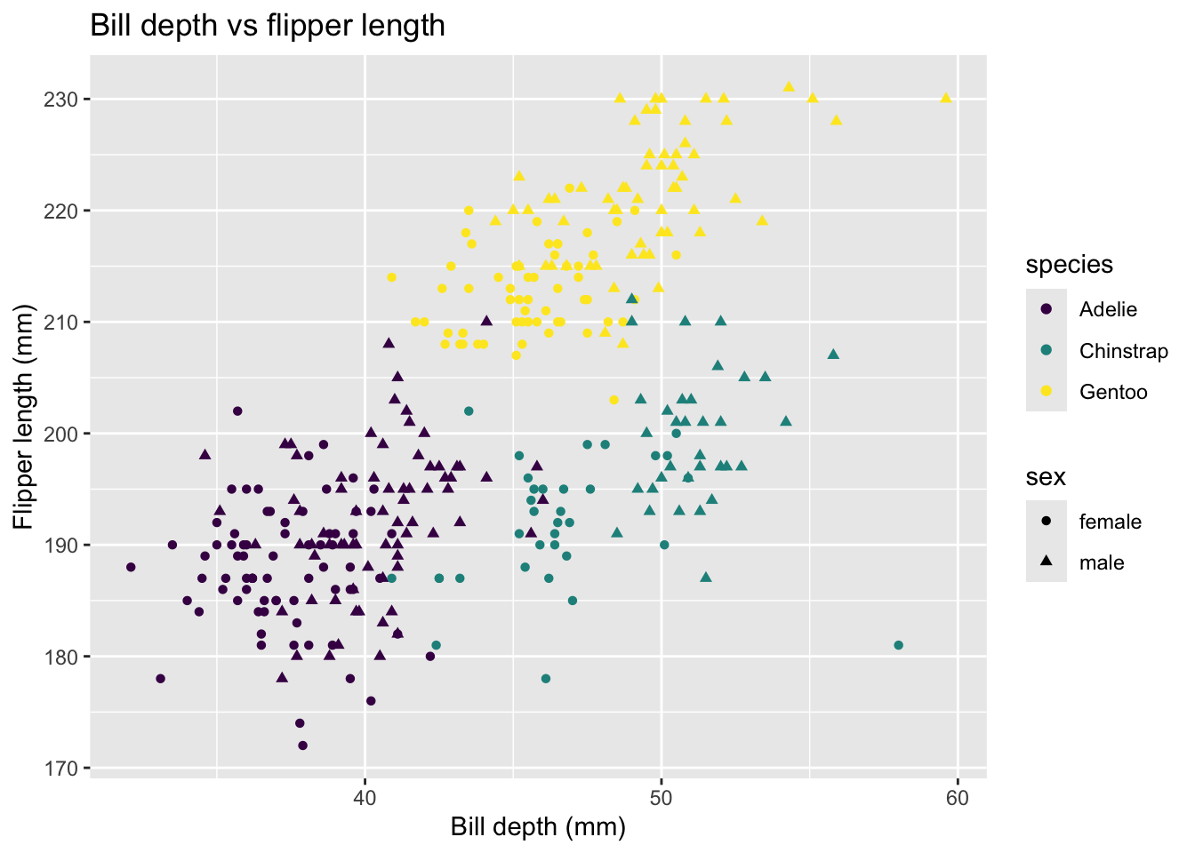
Create this plot with NZ bird themed colours
Geoffrey Thomson has created a beautiful colour package for ggplot that allows you to chose NZ native birds as colour palette themes for making plots. See their website here for more details.
Here’s how to use it:
First, install the package from github:
(we have commented it out here as these packages are already installed on the REANNZ training environment)
# install.packages("devtools")
# devtools::install_github("G-Thomson/Manu")
Then, load the library and have a look at the palette names:
library(Manu)
names(manu_palettes)
[1] "Hihi" "Hoiho" "Kaka" "Kakapo" "Kakariki"
[6] "Kea" "Kereru" "Kereru_orig" "Kiwi" "Kokako"
[11] "Korimako" "Korora" "Kotare" "Putangitangi" "Takahe"
[16] "Takapu" "Titipounamu" "Tui" "Pepetuna" "Pohutukawa"
[21] "Gloomy_Nudi" Now you can have a look at the colours in each palette using the code below. Here we will use Kererū as an example:
kereru <- get_pal("Kereru") # save as new object for using in plot later
print_pal(kereru)
Now, remake the plot from earlier using your chosen bird.
ggplot(data = penData,
       mapping = aes(x = bill_length_mm,
                     y = flipper_length_mm,
                     colour = species,
                     shape = sex)) +
  geom_point() +
  scale_colour_manual(values = kereru) +
  labs(x = "Bill length (mm)",
       y = "Flipper length (mm)") +
ggtitle("Bill length vs flipper length") 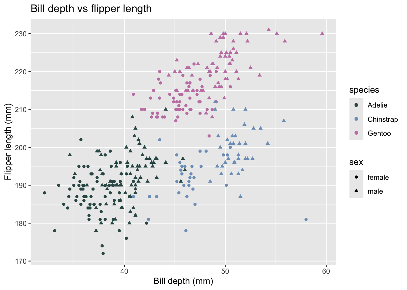
As there are only 3 variables (i.e., 3 species), ggplot has automatically used the first 3 colours from the colour palette.
Tip: See hexadecimal colour codes for more colour options
You can use the scales package to see the colours and their hexadecimal colour codes in RStudio for any vector of hexadecimal colour codes.
First install the scales package: (we have commented it out here as this package is already installed on the REANNZ training environment)
# install.packages("scales")library(scales)Then use the show_col() function to see the colours for any vector of hexadecimal colour codes. For example, here we have used the hexadecimal colour codes for the Kererū palette from the Manu package:
kereru [1] "#325756" "#7d9fc2" "#C582B2" "#51806a" "#4d5f8e" "#A092B7"show_col(kereru)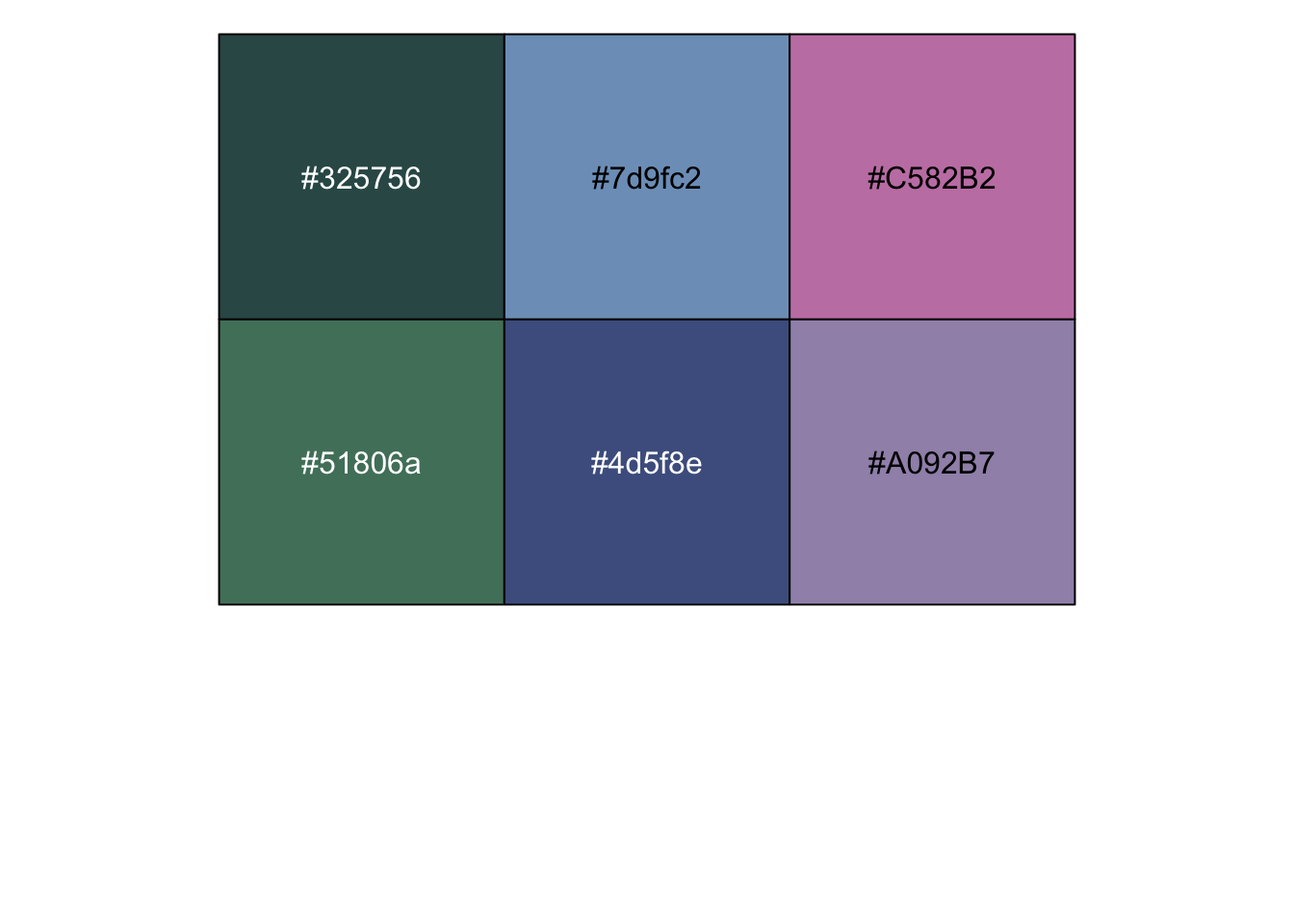
This also works for viridis, using the viridis function to display a custom number of colours from that palette:
show_col(viridis(10))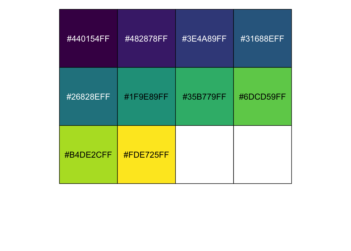
Summary
The ggplot2 template has a simple layout that we will build on throughout the day. Do not worry about memorising all the additional functions or arguments, and expect to use templates as references while you are learning. There will be plenty of examples of code you can refer to throughout this set of material.
A core idea for today is to keep our code as tidy and as well annotated as possible. Endeavor to use comments, section headings, indents and a cohesive format throughout the day.