From Start to Finish: Visualising Your Data
Good visualisation is about more than just writing the correct code. Visualisation is communication, and good communication requires thinking about how we as the scientist/data analyst/creator convey our message to the reader. This one-day workshop will provide you with a toolbox of skills and code examples to help you create clear, visually interesting visualisations which accurately communicate a message.
What’s covered in this workshop
- The basic code template for
ggplot2.
- Types of data visualisations and their impact on how we interpret the data.
- Examples of good visualisations from the community (with code).
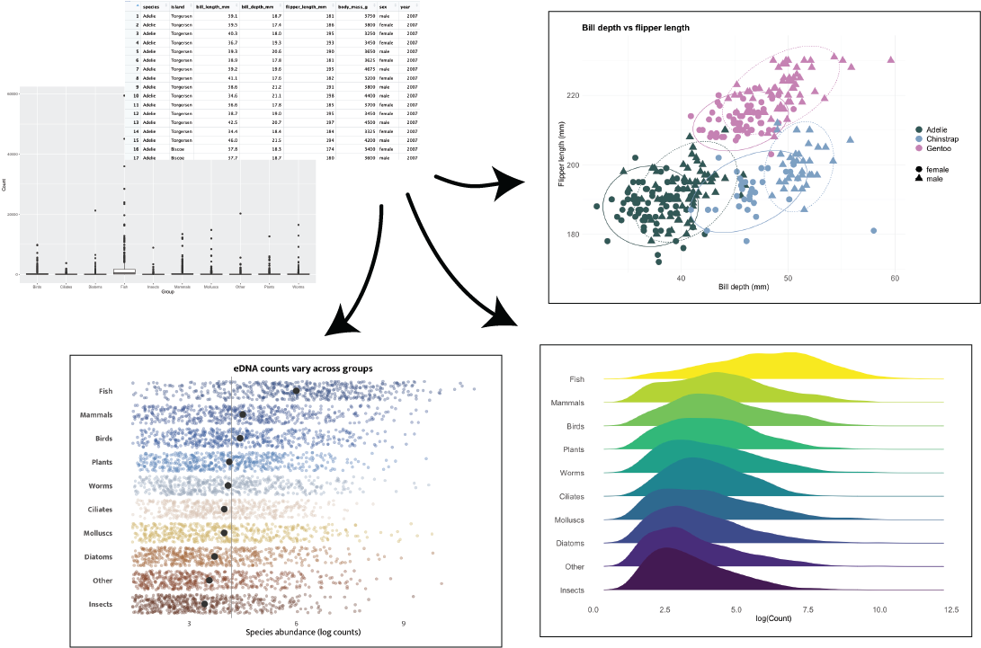
- Evolving a plot from a simple boxplot, building up new geom layers and refining the visualisation.
What’s not covered in this workshop
- Performing statistical analysis on data.
- Interactive or animated plotting.
- Extensive data manipulation and wrangling.
Why are we doing this?
Because some plots look like this (Credit to Dr. Joseph Guhlin for this presentation).
Attribution
This workshop was created by Tyler McInnes, while he was a Bioinformatics Training Coordinator at Genomics Aotearoa, and has been developed further by Chloé van der Burg.
![]()