# install.packages("BiocManager")
# BiocManager::install("limma")
# BiocManager::install("edgeR")
# BiocManager::install("DESeq2")

library(limma)
library(edgeR)
library(dplyr)Identify Differentially Expressed Genes

Are those two groups significantly different from one another is a challenging question to answer. We can start by specifically asking our question as a statistical question: Are the differences we observe between the two groups greater than the differences we would expect to see by chance?
T-tests and p-values
The statistical approach to this question is to begin with the null hypothesis (that there is no difference between the two groups) and test whether or not you can reject the null.
To test whether or not we can reject the null hypothesis we can calculate a test statistic:
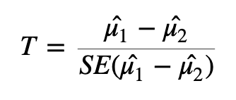
Here we are taking the difference between the means of the two groups and then dividing that difference by some measure of variability - in this case, dividing by the standard error.
If the difference in means is LARGE relative to the variance, the test statistic will be large (indicating significance). If the difference between the means is small relative to the variance, the test statistic will be small, indicating the difference is probably not significant (i.e., the difference we observe is in-line with the variance we observe).
🧠🏋️♀️ EXERCISE (1 min)
With the above formula in mind, what impact would heteroscedasticity have when you are attempting to identify differentially expressed genes?
SOLUTION
Heteroscedasticity would violate the assumption of equal variances that the t-statistic relies on, meaning the standard error \({SE(\hat{\mu}_1 - \hat{\mu}_2)}\) no longer appropriately captures the variability between groups. This would produce unreliable test statistics and therefore untrustworthy p-values. Therefore you could no longer confidently determine whether an observed difference in gene expression between groups was genuine or simply due to chance.
Interpreting p-values
Once we have a test statistic we will calculate a p-value. The p-value is an indication of how likely we were to observe the given difference in means (or a more extreme difference) if there is truly no difference between the means. That is, how likely are we to see this difference due to random chance?
How do we interpret the p-value? We will specify a threshold (usually 0.05), and say that if a p-value is less than this threshold we will consider it a significant result. If the p-value is lower than the threshold we set, we will reject the null hypothesis (that the groups are identical) and accept the alternative (that there is a difference between the groups). The threshold we set is our level of “risk” that this event happened by chance alone.
When we declare that a result with a p-value of less than 0.05 is significant, we are saying that we believe the difference to be true since, if there was truly no difference, such a result would happen less than 5% of the time.
A useful mental analogy is to consider flipping a coin. We know that for a fair coin, the odds of getting heads is 50:50. Still, if we get four heads in a row it doesn’t worry us - it’s entirely plausible given the variation we expect. But if we get 50 heads in a row, while we know it’s statistically possible, we know it’s very unlikely to see such an extreme result. If we got to 100 heads in a row, we might instead start to question the fairness of the coin - we would reject the null hypothesis that the odds of heads and tails is identical.
Types of errors
It’s important to think about the two possible ways in which we could be wrong when testing a hypothesis like this: we could generate a false positive or a false negative.
A false positive or Type I error is when we reject the null hypothesis when there is truly no significant difference.
A false negative or Type II error is when we fail to reject the null hypothesis when there truly is a significant difference.
When we select a p-value threshold of 0.05, we are accepting the fact that 5% of the time that the null hypothesis is true, we will reject it. This becomes hugely problematic when you are testing thousands of genes! In order to avoid a large number of false positives we must correct for multiple testing. The more tests we are doing, the more stringent we need to be. We will not cover multiple testing corrections in depth but will briefly mention two types:
Family-wise Error Rate (FWER), also called the Bonferroni and Holm corrections, is a highly stringent procedure. This approach will give the minimal possible number of false positives, but will miss some true positives. Good if false positives are particularly costly (e.g., if you are providing someone with a severe medical diagnosis).
False Discovery Rate control (FDR), also called the Benjamini and Hochberg correction, is less conservative than FWER. This approach will identify more significant events, but expect a greater number of false positives. Use this approach if you are more concerned about missing something valuable and can afford a few false positives.
🧠🏋️♀️ EXERCISE (3 mins)
Note down some key features of your experiment. Are you more inclined to use FWER or FDR? Which is more appropriate for your data and your experimental situation?
Food for thought
- Are you working with clinical samples, where the stakes are higher if you implicate the wrong gene in disease?
- Are you investigating trends in expression or looking for specific genes?
- How radical is your treatment or conditions used in your epxeriment? Do you have any assumptions about how perturbed or different you expect gene epxression to be between sample groups?
- How many biological replicates do you have? Smaller sample sizes reduce statistical power, making you more prone to Type II errors regardless of which correction you apply.
Modifying the t-test for RNA-seq
Many biological experiments struggle with getting enough samples for statistical significance. In RNA-seq experiments it is common to see groups of three samples or replicates. This is especially problematic when using the t-test (or similar procedures that involve variance). When testing for differences in gene expression it is possible to encounter genes with a small difference in the mean between the two groups and, due to the small sample size, a very small level of variation (a small standard error). A small difference in the means divided by a very small standard error translates to a large test statistic, which is then translated to a small p-value and what looks like a highly significant result.
Since this issue is caused by an artificially low standard error due to low sample numbers, a number of methods have proposed artificially increasing the standard error in some way. One way to implement this is through Shrinkage Estimation, which involves using Empirical Bayes methods to adjust individual test statistics based on the overall distribution of variances. During shrinkage estimation, small standard errors are made larger while large standard errors are made smaller.
Identifying differentially expressed genes using LIMMA
Limma involves data transformation and log scales to account for the data being in a non-normal distribution.
Limma will create one of the special objects mentioned earlier in this workshop to store data. For Limma, this will be called a Digital Gene Expression object (DGE object). We will use the edgeR package to create this DGE object using thwo functions from the edgeR package – DGEList() and normLibSizes() (previously called calcNormFactors()).
Load the libraries required for running limma, create a dge object where we specify counts (here you specify the matrix that contains your counts, in our case our object is already called counts). Then calculate normalisation factors, which will be used to adjust for library size differences.
DGEList() creates a Digital Gene Expression object from your count matrix. This is edgeR’s core data structure and stores your counts along with sample and gene information.
dge <- DGEList(counts=counts)normLibSizes() calculates TMM (Trimmed Mean of M-values) normalisation factors for each sample. These account for differences in library size and composition between samples, ensuring counts are comparable across samples. TMM is the default method used in normLibSizes() and you can specify different methods (try ?normLibSizes()), but TMM is good for pairwise comparisons between two groups of samples (most RNAseq experiments). See here a general guide on understanding count normalisation from HBC training.
dge <- normLibSizes(dge)
Sneak peak at counts
Here we take a peek at the transformed counts using cpm() from the edgeR package. This converts raw counts to log counts per million (log-CPM). The prior.count=3 argument adds 3 to all counts before log transformation (recommended default) – this prevents errors from taking the log of zero, and also reduces the influence of very lowly expressed genes. Soon we will use the voom() function to address heteroscedasticity but we will use our dge object, as voom will perform its own log-CPM transformation internally, and additionally estimate precision weights for each gene (to account for heteroscedasticity).
logCPM <- cpm(dge, log=TRUE, prior.count=3)

head(logCPM, 3)
SI16_21G SI16_23G SI18_30G SI18_48G SI18_52G SI16_22G
LOC117820358 -1.745668 -1.745668 -1.745668 -1.745668 -1.745668 -1.745668
LOC117813751 -1.745668 -1.745668 -1.745668 -1.745668 -1.745668 -0.396939
ccdc51 2.636568 2.615389 3.259466 2.799155 3.665195 2.474228
SI18_15G SI18_16G SI18_18G SI18_22G SI16_1G SI16_2G
LOC117820358 -1.745668 -1.745668 -1.745668 -1.745668 -1.745668 -1.745668
LOC117813751 -1.745668 -1.745668 -1.745668 -1.745668 5.787829 4.777218
ccdc51 4.011476 3.881009 4.038616 4.101756 4.218357 3.856667
SI16_3G SI18_47G SI18_49G
LOC117820358 -1.745668 -1.745668 -1.745668
LOC117813751 4.652893 2.671568 1.512202
ccdc51 3.220906 3.094261 3.047987The design matrix
We use the design matrix to specify our different groups. Here we will specify histology as our main variable for the biological groups we actually want to compare. However, you can also include other information as covariates e.g., here our samples were collected in different batches (batchname), and we have reason to suspect there might be batch-dependent factors involved. You can include many variables as covariates in your design matrix to account for their effects, but today we’ll do just the batchname.
Now we are ready to create our design matrix.
design <- model.matrix(~0 + histology + batchname, data = coldata)


design
histologyF histologyMT histologyTPM batchnameSI18
2 1 0 0 0
4 1 0 0 0
11 1 0 0 1
13 1 0 0 1
15 1 0 0 1
3 0 1 0 0
7 0 1 0 1
8 0 1 0 1
9 0 1 0 1
10 0 1 0 1
1 0 0 1 0
5 0 0 1 0
6 0 0 1 0
12 0 0 1 1
14 0 0 1 1
attr(,"assign")
[1] 1 1 1 2
attr(,"contrasts")
attr(,"contrasts")$histology
[1] "contr.treatment"
attr(,"contrasts")$batchname
[1] "contr.treatment"Covariates in our model
Our design matrix includes histology, the variable we actually want to test, but also batchname. This second term is a covariate – a variable we don’t care about testing directly, but which we suspect explains some of the variation in gene expression alongside histology.
Recall the test statistic formula from earlier: a large test statistic (and therefore a small, significant p-value) comes from a large difference in means relative to variability. If batch effects exist in our data but aren’t included in the model, that variation gets absorbed into the “noise” the model can’t explain, inflating the variability term and making real histology effects harder to detect. By adding batchname to our design, we’re telling the model “some of the scatter in expression is explained by which batch a sample came from, not by its histology group” – this allows the model to separate that structured variation out of the residual error before testing for histology differences, giving us more statistical power to detect genuine biological effects.
It’s worth checking, however, that your covariates aren’t confounded with your variable of interest, for example, if every F sample happened to come from a single batch, the model would have no way to distinguish a batch effect from a histology effect.
Checking with:
table(coldata$histology,coldata$batchname)
      SI16 SI18
  F      2    3
  MT     1    4
  TPM    3    2
before fitting your model is good practice to confirm each batch contains a mix of histology groups.
Addressing heteroscedasticity with Limma
Limma has a function called voom which we can use to address heteroscedasticity (a case where mean and variance are not independent). Voom will estimate the strength of the relationship between mean and variance and calculate “precision weights” for each gene. These are then used to normalise the data during the identification of differentially expressed genes.
Create an object, v, by calling the voom function on the Digital Gene Expression (dge) object. The v object will be used in later analyses. We will add information about our experimental setup by specifying the design object, and we will also call plot = TRUE to generate a plot showing the heteroscedasticity.
v <- voom(dge, design, plot = TRUE)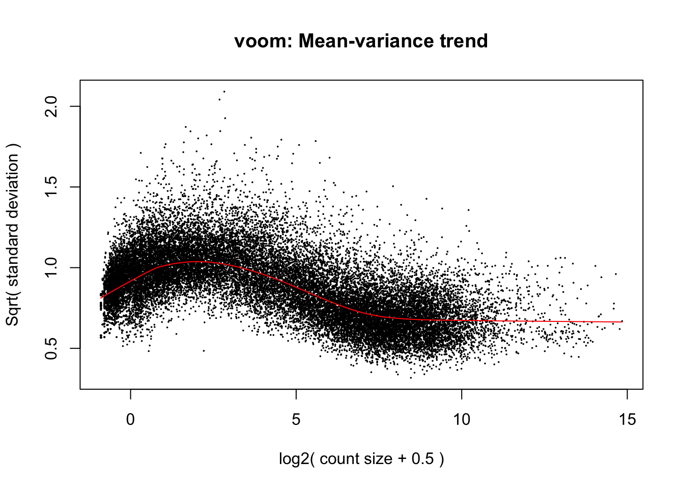
This plot highlights an earlier point about heteroscedasticity. For genes with low expression, the variance (here the square root of the standard deviation) is highly variable. Because the variance is dependent on the mean, we describe this data as heteroscedastic. Our v (voom) object contains information relating to the curve line (red) and makes an adjustment factor, so that the data will have a uniform relationship between the mean and variance.
Importantly, other than changing the mean-variance relationship, voom does not cause significant changes to the underlying data.
DISCUSSION 🤔 (1 min)
What do you think is causing the “dip” in the plot on the left hand side?
SOLUTION
That dip-then-rise shape at the low end of the x-axis (sometimes called a “hook”) comes from genes with very low counts. When counts are close to zero, they are discrete and have little room to vary, so the estimated variance for these genes is artificially compressed. As expression increases slightly, genes have more “room” to show genuine biological variability, so the variance rises, before the expected mean-variance trend (variance decreasing as counts increase) takes over.
This is a sign that some very lowly-expressed, unreliable genes are still present in the dataset. It’s a useful reminder of why filtering out lowly expressed genes (e.g., with edgeR::filterByExpr()) before running voom() is good practice – it removes genes that don’t carry reliable information and would otherwise distort the mean-variance trend voom is trying to model.
See as an example the exact same issue in this blog post, 10+ years ago!
The impacts of voom
Demo only
# Original counts, log transformed
boxplot(as.matrix(log2(counts +1)) ~ col(counts),
        ylab = "Counts",
        xlab = "Samples",
        names = colnames(counts),
        main = "Log counts of samples (original)")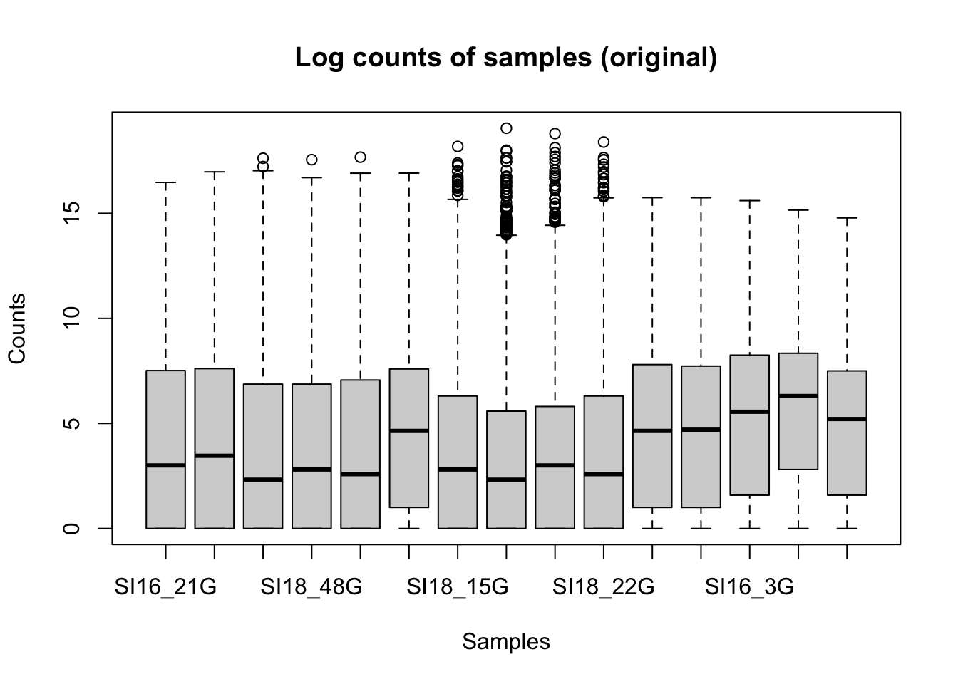
# Voom corrected log transformed counts
boxplot(v$E ~ col(v$E), ylab = "Counts", xlab = "Samples", main = "Log counts after voom")
We can see that log counts in the voom object (that is, counts after voom has been applied to create a stable mean-variance relationship) have not drastically changed from when we plotted them earlier.
Voom should stabilise mean-variance without removing differences between sample groups
What if we wanted to remove these differences? Remember, we (probably) cannot be certain as to whether these differences are biological or technical. In cases like this it can be good to run your analysis multiple ways - first without removing the differences, and then after removing the differences. If a decision like this causes your results to change drastically then you need to be aware of the impact your choices are having so that you can make an informed decision about how to investigate further.
Quantile normalisation is one method you can use to remove differences between sample groups, but note that quantile normalisation is a drastic intervention and should not be undertaken without a real need.
Detecting differentially expressed genes
We will use the lmFit() command to fit a linear model for every gene using our v (voom) object and the design matrix, then fit out contrasts with contrasts.fit(), and then finally use the eBayes() function on the linear model to perform Empirical Bayes shrinkage estimation and return moderated test statistics. The topTable() function will then be used to extract the results of the analysis.
fit <- lmFit(v, design)Now we need to define the contrasts. This is where you will have to do some editting for your own samples. For each comparison that you want to test, you will need to define a contrast. In this example, we have three histology groups (F, MT, TPM) and we want to compare each of them to one another. We will define three contrasts: MT vs F, TPM vs F, and TPM vs MT. It does not matter which order you define the contrast, but it is important to be consistent with your definition of the contrast when interpreting the results. For example, if you define MT vs F as histologyMT - histologyF, then a positive log fold change (logFC) value will indicate that the gene is upregulated in MT relative to F, while a negative logFC value will indicate that the gene is downregulated in MT relative to F.
The names on the left can be anything you want (e.g., “MT_vs_F” could be “MidTrans_vs_Fem”), but the names on the right must match the column names of your design matrix exactly (e.g., “histologyMT”, “histologyF”). You can check the column names of your design matrix by running colnames(design).
contrasts.matrix <- makeContrasts(
  MT_vs_F   = histologyMT - histologyF,
  TPM_vs_F  = histologyTPM - histologyF,
  TPM_vs_MT = histologyTPM - histologyMT,
  levels    = colnames(design)
)
Now that we have defined contrasts we can fit the contrasts to our linear model and then use the eBayes() function to perform Empirical Bayes shrinkage estimation and return moderated test statistics.
fitC <- contrasts.fit(fit, contrasts = contrasts.matrix)
fitC <- eBayes(fitC)
The fitC object is complex to look at. We will use the topTable function to retrieve the useful information (gene name, logFC, adjusted p values), and then filter for significant genes only. We will also save the topTable object (tt) for use in the next episode. Here you can set your coef argument to the contrast you want to extract results for. In this case we will extract the results for TPM vs F. You can also set the n argument to the number of genes you want to retrieve. Here we will set it to the total number of genes in our dataset (nrow(counts) will evaluate to a number) so that we can filter for significant genes later.
tt_TPM_vs_F <- topTable(fitC, coef="TPM_vs_F", n=nrow(counts))

head(tt_TPM_vs_F)
logFC AveExpr t P.Value adj.P.Val B
LOC117820404 -7.305748 9.645904 -33.06425 5.990343e-17 8.464654e-13 28.16714
LOC117807238 -8.831337 9.211953 -33.12606 5.804638e-17 8.464654e-13 28.03025
zp3c -11.265809 9.940876 -30.30652 2.596236e-16 1.604154e-12 26.54636
fabp4b -6.684120 8.755295 -29.03863 5.323425e-16 1.604154e-12 26.32200
snx10a -10.465188 7.280628 -32.02773 1.024659e-16 9.652626e-13 26.06244
LOC117827696 -10.524305 9.233299 -29.19434 4.866236e-16 1.604154e-12 25.97129sum(tt_TPM_vs_F$adj.P.Val < 0.05)[1] 18744sum(tt_TPM_vs_F$adj.P.Val < 0.01)[1] 13221#save(tt, file="tt.RData")EXERCISE 🧠🏋️♀️ (4 mins)
Now its your turn! Use the topTable function to extract the results for MT vs F and TPM vs MT. How many significant genes do you find for each comparison?
SOLUTION
tt_MT_vs_F <- topTable(fitC, coef="MT_vs_F", n=nrow(counts))

head(tt_MT_vs_F)
logFC AveExpr t P.Value adj.P.Val B
plat 6.379898 0.6402365 11.23256 2.555089e-09 2.445801e-05 11.46109
tgm2b 4.139278 3.2417638 10.87879 4.144949e-09 2.445801e-05 11.10577
acanb 6.334556 1.2089455 10.84391 4.350228e-09 2.445801e-05 11.04639
LOC117808585 6.081913 -0.4322898 10.87404 4.172262e-09 2.445801e-05 10.94840
cebp1 4.201666 -0.8939539 11.05188 3.266374e-09 2.445801e-05 10.93949
bpifcl 4.755733 3.1494619 10.71695 5.192599e-09 2.445801e-05 10.84407sum(tt_MT_vs_F$adj.P.Val < 0.05)[1] 4955sum(tt_MT_vs_F$adj.P.Val < 0.01)[1] 1920tt_TPM_vs_MT <- topTable(fitC, coef="TPM_vs_MT", n=nrow(counts))
head(tt_TPM_vs_MT) logFC AveExpr t P.Value adj.P.Val B
LOC117820404 -7.984876 9.645904 -34.70114 2.650755e-17 7.491299e-13 28.68594
LOC117807238 -8.680157 9.211953 -31.42376 1.411939e-16 9.940338e-13 27.20839
fabp4b -7.350411 8.755295 -30.68465 2.107539e-16 9.940338e-13 26.99972
zp3c -11.720390 9.940876 -30.68217 2.110401e-16 9.940338e-13 26.61972
LOC117815094 -11.671132 8.151310 -31.10943 1.672280e-16 9.940338e-13 25.89876
snx10a -10.380077 7.280628 -31.58536 1.295118e-16 9.940338e-13 25.88665sum(tt_TPM_vs_MT$adj.P.Val < 0.05)[1] 15728sum(tt_TPM_vs_MT$adj.P.Val < 0.01)[1] 12434EXERCISE 🧠🏋️♀️ (4 mins)
Our output includes an adjusted p-value. Use the help function (type a ? in front of any function name) to learn what method was used to adjust for multiple testing. Using information from the help menu, change the correction method to something different. How does this impact your results?
SOLUTION
?topTable shows that the adjust.method argument controls multiple testing correction, and defaults to "BH" (Benjamini-Hochberg / FDR). Other options accepted are those listed in ?p.adjust, e.g., "bonferroni", "holm", "hochberg", "BY", or "none".
tt_TPM_vs_F_bonf <- topTable(fitC, coef="TPM_vs_F", n=nrow(counts), adjust.method="bonferroni")

# bonferroni method
sum(tt_TPM_vs_F_bonf$adj.P.Val < 0.05)
[1] 4416# default BH (FDR) method
sum(tt_TPM_vs_F$adj.P.Val < 0.05)[1] 18744Switching from the default "BH" to the more stringent "bonferroni" correction reduces the number of genes considered significant, since Bonferroni controls the family-wise error rate rather than the false discovery rate (see the earlier section on Types of errors).
Save limma results
It’s good practice to save your topTable results as a plain text file so they can be shared, inspected in Excel, or read back in later without re-running the analysis. Since topTable() already returns a data frame, we can write it straight out with write.table().
write.table(tt_TPM_vs_F, file = "tt_TPM_vs_F.tsv", sep = "\t", quote = FALSE, row.names = TRUE, col.names = NA)

write.table(tt_MT_vs_F, file = "tt_MT_vs_F.tsv", sep = "\t", quote = FALSE, row.names = TRUE, col.names = NA)

write.table(tt_TPM_vs_MT, file = "tt_TPM_vs_MT.tsv", sep = "\t", quote = FALSE, row.names = TRUE, col.names = NA)
row.names = TRUE keeps the gene identifiers (which are stored as row names in the topTable output) as the first column of the saved file. Using sep = "\t" writes a tab-separated (.tsv) file, and quote = FALSE avoids wrapping every value in quotation marks.
Let’s make an object to store all the information for our list of significantly differentially expressed genes. We will use a threshold of an adjusted p-value < 0.05 and a logFC > 1. This will grab all upregulated genes – which in this contrast means up in TPM. We will return to this object later!
The which() function returns index positions, which we then use to subset out the rows we want to keep.
sigGenesLimma_TPM_vs_F <- which(tt_TPM_vs_F$adj.P.Val <= 0.05 & tt_TPM_vs_F$logFC > 1)

sigGenesLimma_TPM_vs_F <- tt_TPM_vs_F[sigGenesLimma_TPM_vs_F, ]Volcano plots
Volcano plots are a useful and commonly used method to visualise differentially expressed genes within your data set.
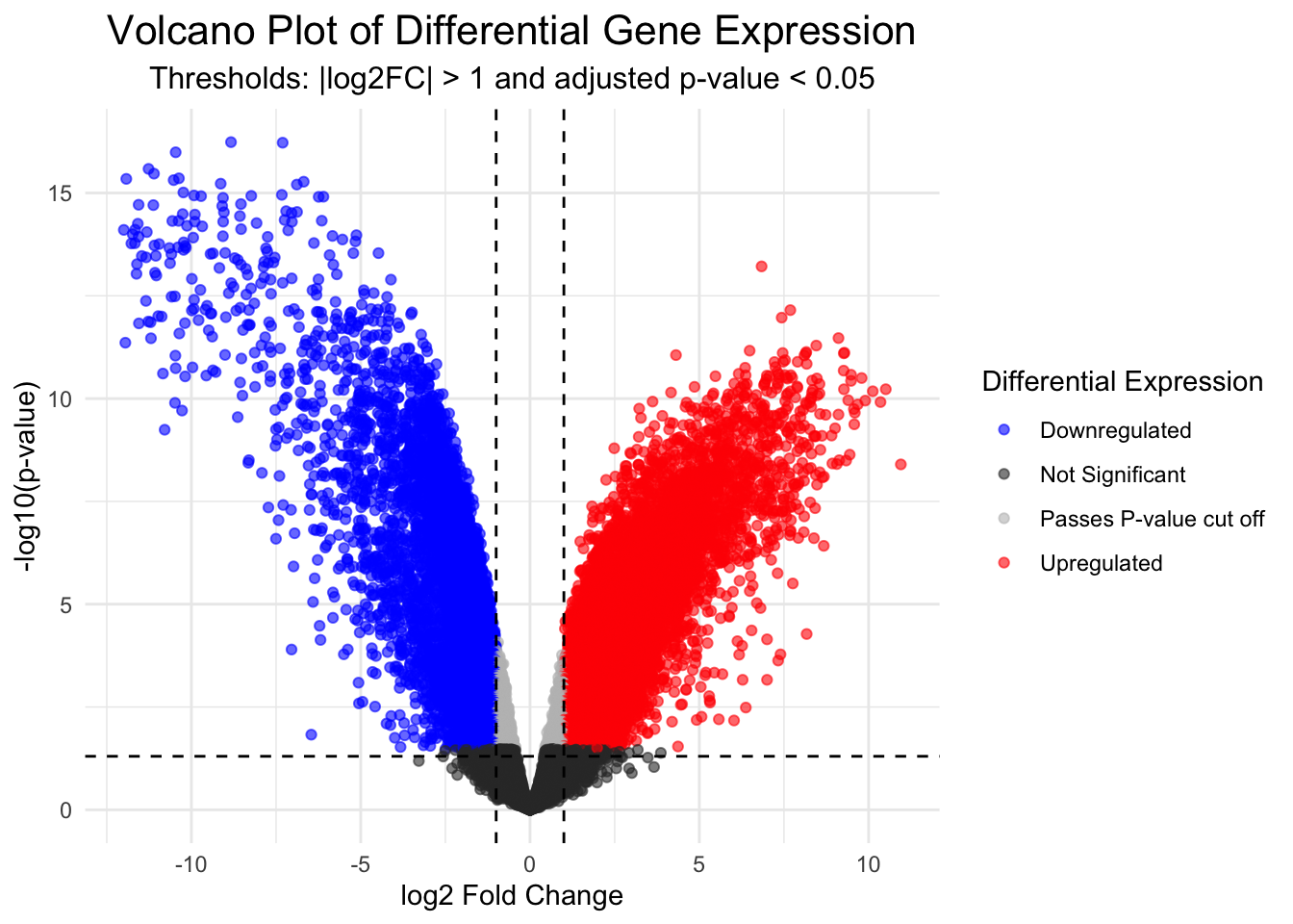
In the following code we will first produce the volcano plot itself, which shows the distribution of all genes according to p-value and log2 fold change.
Statistical significance is often not the only measure we will use to call genes differentially expressed. It is common to apply an additional threshold of gene expression needing to double or halve to be considered differentially expressed. On the log2FC scale, this is log2(2) (i.e., a value > 1 or < -1).
Genes will be coloured based on whether they are up (red) or down (blue) regulated.
This plot is an important “sanity check”. We can logically check that our significant genes (in red) are those with both a p-value < 0.05 and a log2 fold change greater than 1 (which is equivalent to a doubling or halving of gene expression). If we observe red marked dots in the center or bottom of the plot, we could recognise an error has occurred.
library(dplyr)


# Define significance thresholds
pval_threshold <- 0.05
fc_threshold <- 1  # log2 fold change threshold

# Create a data frame for plotting - CHANGE tt OBJECT NAME TO MATCH YOUR DATA
plot_data <- data.frame(
  logFC = tt_TPM_vs_F$logFC,
  negLogPval = -log10(tt_TPM_vs_F$P.Value),
  adj.P.Val = tt_TPM_vs_F$adj.P.Val,
  ID = rownames(tt_TPM_vs_F)  # Assuming row names are gene IDs
)

# Add a column to categorize genes
plot_data$category <- ifelse(plot_data$adj.P.Val <= pval_threshold,
                             ifelse(plot_data$logFC >= fc_threshold, "Upregulated",
                                    ifelse(plot_data$logFC <= -fc_threshold, "Downregulated", "Passes P-value cut off")),
"Not Significant")library(ggplot2)
library(ggiraph)
# Create the volcano plot using ggplot2
ggplot(plot_data, aes(x = logFC, y = negLogPval, color = category)) +
geom_point(alpha = 0.6, size = 1.5) +
scale_color_manual(values = c("Upregulated" = "red", "Downregulated" = "blue", "Not Significant" = "grey20", "Passes P-value cut off" = "grey")) +
geom_vline(xintercept = c(-fc_threshold, fc_threshold), linetype = "dashed") +
geom_hline(yintercept = -log10(pval_threshold), linetype = "dashed") +
labs(
title = "Volcano Plot of Differential Gene Expression",
subtitle = paste("Thresholds: |log2FC| >", fc_threshold, "and adjusted p-value <", pval_threshold),
x = "log2 Fold Change",
y = "-log10(p-value)",
color = "Differential Expression"
) +
theme_minimal() +
theme(
legend.position = "right",
plot.title = element_text(hjust = 0.5, size = 16),
plot.subtitle = element_text(hjust = 0.5, size = 12)
)
# Save the plot (optional)
ggsave("volcano_plot.png", width = 10, height = 8, dpi = 300)DISCUSSION 🤔 (2 mins)
We can see the blue dots are downregulated genes and the red dots are upregulated genes. But downregulated in what? Upregulated in what?
SOLUTION
It’s relative! The contrast we defined here was TPM_vs_F = histologyTPM - histologyF. Therefore, downregulated genes (blue) are those that are expressed less in TPM, than in F, while upregulated genes (red) are expressed more in TPM, than in F.
The opposite is also always true. Genes that are downregulated in TPM are upregulated in F, and vice versa. It’s always relative to the order in which we define the contrast and relative to the groups being compared.
Interactive Volcano plot
We can also produce an interactive volcano plot with the ggigraph package.
Hint: you should not need to change any of this code below to work with your data, if you got the above ggplot code to work!
# Create the ggplot object
p <- ggplot(plot_data, aes(x = logFC, y = negLogPval, color = category, text = ID)) +
  geom_point(alpha = 0.6, size = 2) +
  scale_color_manual(values = c("Upregulated" = "red", "Downregulated" = "blue", "Not Significant" = "grey20", "Passes P-value cut off" = "grey")) +
  geom_vline(xintercept = c(-fc_threshold, fc_threshold), linetype = "dashed") +
  geom_hline(yintercept = -log10(pval_threshold), linetype = "dashed") +
  labs(
    title = "Interactive Volcano Plot of Differential Gene Expression",
    subtitle = paste("Thresholds: |log2FC| >", fc_threshold, "and adjusted p-value <", pval_threshold),
    x = "log2 Fold Change",
    y = "-log10(p-value)",
    color = "Differential Expression"
  ) +
  theme_minimal() +
  theme(
    legend.position = "right",
    plot.title = element_text(hjust = 0.5, size = 16),
    plot.subtitle = element_text(hjust = 0.5, size = 12)
)library(ggiraph)
library(plotly)
# Convert ggplot to an interactive plotly object
interactive_plot <- ggplotly(p, tooltip = c("text", "x", "y", "color"))
# Customize hover text
interactive_plot <- interactive_plot |>
layout(hoverlabel = list(bgcolor = "white"),
hovermode = "closest")
# Display the interactive plot
interactive_plotHover with your mouse over the points above to see pop up boxes with gene names, category, logFC and negLogPval. You can also zoom in and out, and pan around the plot to explore the data.
Identifying differentially expressed genes using DESeq2
DESeq2 is a highly-regarded R package for analysing RNA-seq data. DESeq2 uses a negative binomial method to model the count data, and combines this with a generalised linear model (GLM) to identify differentially expressed genes. For more about the DESeq2 package, you can read the original article.
The DESeq2 object
The DESeq2 package requires a specific data storage object called a “DESeq Data Set” or DDS object. The DDS object contains not just the count data, but also the metadata and the design matrix. This object can be created using a function from the DESeq2 package called DESeqDataSetFromMatrix() Once we have created the dds object, we can view the data stored within using the counts function.
library(DESeq2)

coldata$histology <- factor(coldata$histology, levels = c("F", "MT", "TPM"))
coldata$batchname <- factor(coldata$batchname)

dds <- DESeqDataSetFromMatrix(countData = counts,
                              colData = coldata,
                              design = ~histology + batchname)
Why factorise?
This is not strictly necessary – the code won’t break, as DESeq2 will automatically convert character columns to factors (although numeric columns will likely error and must be factorised first!)
But in our case we want to set an order, which we should do with factor().
This is because F, MT, and TPM represent a chronological transition in state (i.e., gonads transition from female –> multiple distinct transitional states –> terminal phase male), and we want this order reflected in our results. The same order also comes up when using ggplot2, if we want the x-axis to plot in a specific order rather than alphabetically.
The design matrix can be pulled directly from the data provided to the colData argument.
Alternatively, use design = ~1 to fit an intercept-only model (no condition effect), useful for testing out normalisation or transformation steps where group comparisons aren’t needed.
Raw counts can be retrieved from our dds object using the function counts() from the DESeq2 package.
counts(dds) |> head() SI16_21G SI16_23G SI18_30G SI18_48G SI18_52G SI16_22G SI18_15G
LOC117820358 0 0 0 0 0 0 0
LOC117813751 0 0 0 0 0 5 0
ccdc51 55 62 63 46 93 57 83
tma7 1256 2246 1492 1870 1664 2506 1514
LOC117815572 2 1 2 1 1 11 1
LOC117818779 0 1 0 0 0 2 2
SI18_16G SI18_18G SI18_22G SI16_1G SI16_2G SI16_3G SI18_47G
LOC117820358 0 0 0 0 0 0 0
LOC117813751 0 0 0 723 346 482 140
ccdc51 52 61 85 241 181 175 190
tma7 1322 1053 1129 3262 3098 3050 2336
LOC117815572 3 0 4 3 3 22 30
LOC117818779 2 0 1 0 3 0 16
SI18_49G
LOC117820358 0
LOC117813751 33
ccdc51 103
tma7 2245
LOC117815572 15
LOC117818779 0Now fit the DESeq2 generalised linear model to the data.
dds <- DESeq(dds)estimating size factorsestimating dispersionsgene-wise dispersion estimatesmean-dispersion relationshipfinal dispersion estimatesfitting model and testingNote the outputs from running this function. What are these outputs?
Estimating size factors: assesses library size and calculates factors to adjust for differences between samples. This also adjusts for compositional differences (e.g., if gene X in sample 1 takes up a very large proportion of all available reads, other genes will have correspondingly fewer genes. If this effect is not uniform across samples, it can be corrected for during this stage).
Dispersion: adjusting for heteroscedasticity. DESeq2 makes use of variability estimates from not just one gene, but from all genes to make estimates about overall levels of variance. By bringing in (or “borrowing”) information from other genes, DESeq2 compensates for a small number of samples (which can lead to artificially small variance estimates otherwise).
Fitting model and testing: fitting the GLM and identifying differentially expressed genes.
These steps were done in separate functions in the Limma workflow, but DESeq2 does it all in one function.
We will create a new object to store the results in. We can access those results using either the head function or the summary function, which will give us slightly different information – both are valid and useful ways of familiarising yourself with the data.
res_F_vs_TPM <- results(dds, contrast = c("histology", "F", "TPM"))

res_F_vs_TPM |> head()
log2 fold change (MLE): histology F vs TPM
Wald test p-value: histology F vs TPM
DataFrame with 6 rows and 6 columns
baseMean log2FoldChange lfcSE stat pvalue
<numeric> <numeric> <numeric> <numeric> <numeric>
LOC117820358 0.00000 NA NA NA NA
LOC117813751 72.65818 -9.183293 0.967298 -9.493757 2.22854e-21
ccdc51 94.55083 -0.984036 0.375143 -2.623093 8.71355e-03
tma7 1891.60802 -0.134454 0.297961 -0.451246 6.51812e-01
LOC117815572 4.59230 -2.576477 0.906197 -2.843174 4.46666e-03
LOC117818779 1.37837 -2.735360 1.823510 -1.500052 1.33601e-01
padj
<numeric>
LOC117820358 NA
LOC117813751 4.26248e-20
ccdc51 1.53114e-02
tma7 6.99225e-01
LOC117815572 8.37165e-03
LOC117818779 1.77923e-01res_F_vs_TPM |> summary()
out of 25904 with nonzero total read count
adjusted p-value < 0.1
LFC > 0 (up)       : 5654, 22%
LFC < 0 (down)     : 10960, 42%
outliers [1]       : 131, 0.51%
low counts [2]     : 2000, 7.7%
(mean count < 0)
[1] see 'cooksCutoff' argument of ?results
[2] see 'independentFiltering' argument of ?results
Bonus: view coefficients and pull out by name
We can also pull out the native comparisons that are generated during analysis using:
resultsNames(dds)[1] "Intercept" "histology_MT_vs_F" "histology_TPM_vs_F"
[4] "batchname_SI18_vs_SI16"This lists every coefficient DESeq2 estimated directly when fitting the model. Because we set F as the reference level for histology, DESeq2 estimated each other level against F – so resultsNames() gives us histology_MT_vs_F and histology_TPM_vs_F, but not MT_vs_TPM
We can pull either of these straight out by name:
res_MT_vs_F <- results(dds, name = "histology_MT_vs_F" ) name and contrast will give you identical results whenever the comparison you want is against the reference level (here, F). name is just a shortcut that skips DESeq2 recomputing the contrast. For any comparison that isn’t against the reference level (e.g. MT vs TPM), you must use contrast instead, since that comparison/coefficient was never directly estimated.
Handy tip!
Want to save and output your full results now as a nice human readable table? Convert the res object to a dataframe, and then read out the table as a tsv file:
res_F_vs_TPM_df <- res_F_vs_TPM |> as.data.frame()

write.table(res_F_vs_TPM_df,  file = "deseq2_F-vs-TPM-results.tsv", sep = "\t", quote = FALSE, row.names = TRUE)
The res object contains information for all genes tested. It is practical to create a new object that contains only the genes we consider differentially expressed based on the thresholds (p-value, logFC) and methods (e.g., multiple testing adjustment) that suit our situation.
We will remove any rows that have NAs in the results object, then pull out only those with an adjusted p-value less than 0.05. We are also going to keep all genes that are upregulated in TPM, so that we can directly compare to our limma results from earlier. Because the contrast we generated here is contrast = c("histology", "F", "TPM")) this means that all genes with a positive logFC are upregulated in the first condition “F”. We want genes that are upregulated in the second condition “TPM”. To get these, we can simply grab all genes that are less than -1 logFC because anything downregulated in the first condition “F” is inherently upregulated in the second condition “TPM”.
res_F_vs_TPM <- res_F_vs_TPM |> na.omit()

# Get dimensions
res_F_vs_TPM   |> dim()
[1] 23773 6# Keep all rows in the res object if the adjusted p-value < 0.05 AND the log2 fold change is less than -1.
resPadjLogFC_F_vs_TPM <- res_F_vs_TPM[res_F_vs_TPM$padj <= 0.05 & res_F_vs_TPM$log2FoldChange < -1,]
# Get dimensions
resPadjLogFC_F_vs_TPM |> dim() [1] 9534 6EXERCISE 🧠🏋️♀️ (2 mins) - Identify method for multiple testing corrections
Bioinformatics can often be something of a “black box” - we execute a function by feeding in some data, and get new data as output. It’s very easy to fall into the trap of believing your data without asking all the necessary questions. For example, we’ve just used an adjusted p-value for our threshold for significance. Did you question which method was used to adjust for multiple testing? See if you can identify, using the help menu, which method was used here. Try and specify a different method for multiple testing corrections and note how this alters your output.
SOLUTION
The ?results help info will show the default p adjustment method is pAdjustMethod = "BH". Further reading will show that options for this come from ?p.adjust, which lists the following options:
"holm", "hochberg", "hommel", "bonferroni", "BH", "BY", "fdr", "none"
The default BH method is Benjamini & Hochberg (or the FDR method), which is described here in the R documentation.
Differentially expressed gene lists
To recap, we’ve now produced two lists of differentially expressed genes - one produced with the Limma method (called sigGenesLimma_TPM_vs_F), one with DESeq2 (called resPadjLogFC_F_vs_TPM). In both cases we used the same threshold for statistical significance (adjusted p-value < 0.05, using the FDR correction) and biological significance (logFC more than 1 or less than negative 1, which is equivalent to a doubling or halving gene expression).
In our run-through, Limma identified 9232 differentially expressed genes, while DESeq2 identified 9534 genes.
These numbers are very similar, but what’s the actual overlap between these two groups? A venn diagram is an easy way to visualise the relationship between the two groups. First, load the gplots library which we will use for making venn diagrams. Create an object, which we will call setlist, that lists the two gene sets (in our case, this will be the rownames of the objects we created with Limma and DESeq2). Finally, use the venn() function to create a venn diagram.
# BiocManager::install("gplots")
library(gplots)

setlist <- list(Limma = rownames(sigGenesLimma_TPM_vs_F),
                DESeq2 = rownames(resPadjLogFC_F_vs_TPM ))

venn(setlist)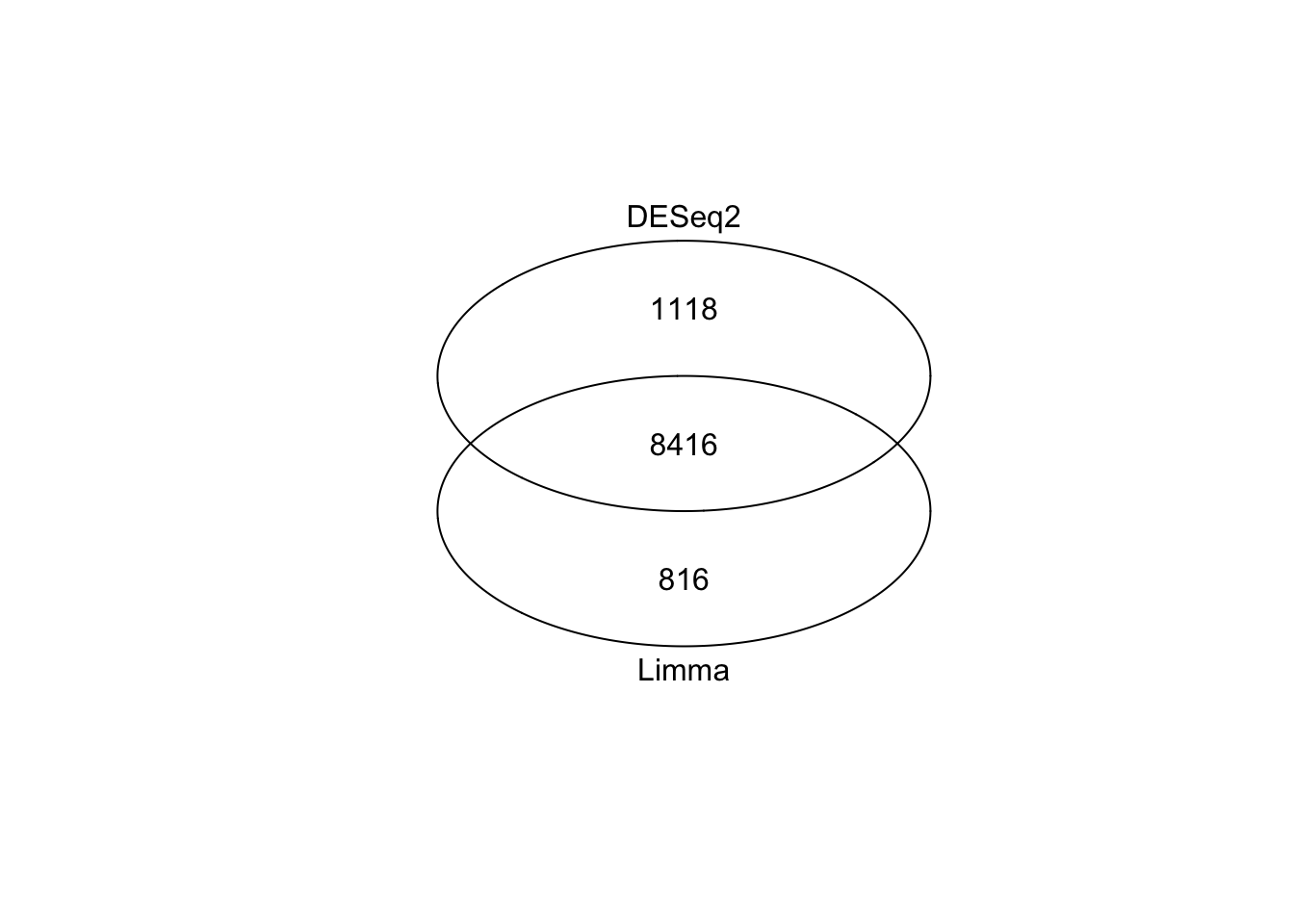
This is a strong concordance between our two methods and gives us high confidence in our approach. At this point you could take the overlap (n = 8416 genes) only, take all genes (8416 + 816 + 1118 = 10350), or take genes from just one method (more relevant if one method was conservative compared to the other). Exactly how you resolve this step will depend on the exact shape of your venn diagram and your context.
For simplicity, we will take the list of all genes identified by DEseq2 and see in the next episode how we can derive meaningful biological information from this long list of genes.
How to pull out venn intersection gene lists
# Convert venn data to list object
intersect_list <- attr(venn(setlist, show.plot = FALSE), "intersections")
intersect_list  |> str()
List of 3
$ Limma:DESeq2: chr [1:8416] "LOC117808765" "LOC117830219" "LOC117819294" "ribc1" ...
$ Limma : chr [1:816] "si:cabz01071907.1" "LOC117820055" "grk1a" "LOC117819808" ...
$ DESeq2 : chr [1:1118] "LOC117823012" "dnajc16l" "foxp4" "fam72a" ...# Create vectors of the three gene lists
Limma_only_genes <- intersect_list$Limma
DEseq2_only_genes <- intersect_list$DESeq2
Both_genes <- intersect_list$`Limma:DESeq2`